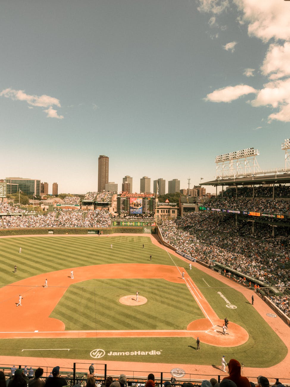
Being a lifelong fan of the Chicago Cubs, I’ve always thought their uniforms were among the best in all of sports. Here are the ones that still stand out to me today.
There’s no doubt that I have always enjoyed writing and talking about sports, with my lifelong interest serving as an easy way to form connections with people and start conversations.
Beyond just discussing the ins-and-outs of particular teams and what’s going on within pro sports leagues, another conversation I have long enjoyed having with other fans revolve around what uniforms stand out as their favorites.
It goes without saying that essentially all fans are going to be biased towards the colors their favorite team wears – and I’m certainly no exception in that regard. When it comes to having a classic, clean logo with a set of uniforms rarely ever changed, the Cubs’ track record speaks for itself.
Hell, that opinion spreads to what I think about my other favorite teams as well. I’d put the Boston Celtics’ home white jerseys up against any of their counterparts in the NBA, while the Seattle Kraken have upheld the lofty uniform standards set by other Seattle teams.
Yet even within the wardrobes of our favorite teams, not all uniforms are created equal. While I generally like all of the Cubs’ uniforms, there have been some misses over the years.
Though I’m too young to remember, the team’s away jerseys from the mid-1990’s continue to live in infamy, featuring red cursive text that read “Cubs” over a grey jersey – in a font that made “Cubs” look a lot like “Cuba.”

I’d be the first to say that I thoroughly enjoy all four of their current official uniforms, and believe it’s among one of their stronger uniform sets of my lifetime – yet I still have my preferences.
With the Cubs’ current uniform wardrobe consisting of a home uniform, away uniform and two alternates, here’s a look at how I’d rank the four current kits:
4. Powder blue alternate

While this jersey is undoubtedly a massive improvement over the Cubs’ previous “Wrigleyville” City Connect uniforms, I still rank it just a tad below their three longstanding kits.
This jersey includes a lot of features that stay faithful to both the franchise and the city of Chicago. Featuring a guitar pick like design on the shoulder patch that reads “Chicago,” the uniform includes a retro-inspired Cubs logo on one side of the chest with the player’s number on the opposite side, paired with a blue and white two-tone hat.
However, this uniform I think could be vastly improved with two changes – corresponding powder blue pants and at least some usage, if not exclusive usage, on the road.
Though these uniforms have since been established as the preeminent choice for Friday afternoon home games, they’d look even sharper with matching bottoms on the road, which would offer a nod to the era of powder blue taking over as the primary away jersey color for many teams.
Still, this jersey is a very sharp offering that exceeded my expectations and is among the stronger alternates in the league.
3. Primary away

A longtime staple of the club’s wardrobe, these away jerseys served as the successor to the aforementioned “Cuba” jerseys, with this particular style becoming the team’s primary road jerseys for the 1999 season.
While grey jerseys are polarizing for many fans, I’ve always thought the Cubs away jerseys stood out as among one of the stronger options in the game, with a fitting inclusion of red throughout, the team’s tertiary color.
Although I still greatly enjoy seeing these uniforms at least once each road series, they also could be made a good deal better with one retroactive fix – reinstating the two-toned hats with red bills for away games while wearing the grey jerseys. Previously utilized throughout the 2000’s, the change back would be a welcome, nostalgic shift for the Cubs’ uniforms.
Though one of the better grey jerseys, I still do find myself preferring to see the Cubs alternate jersey for many road games – and perhaps a bit more than that as well.
2. Blue alternate

One of the longer-running alternate jerseys in all of baseball, the first iteration of this jersey was introduced for the 1997 season, just one year after I was born. Though some small changes have been made over the years, this kit has remained a staple in the Cubs’ wardrobe.
A perfect road alternate, the jersey remains a popular choice by the team for many away games – with the kit permanently immortalized by Cubs fans for being the jerseys worn during their Game 7 victory in the 2016 World Series.
Though the jersey is near-exclusively worn on the road today, the blue alternates were also seen plenty at Wrigley Field throughout the 2000’s, with the uniforms known to be the favorite of longtime Cubs starter Carlos Zambrano.
The only way to improve this uniform today for me would be to pepper in a few games each season where the blue tops are worn for home games, while also adding the two-toned hats with red bills to the kit when used for away games.
Yet as it stands, the jersey remains a clean, classic look for one of the most historic franchises in all of North American professional sports.
1. Primary home

Featuring a classic blue pinstripe design with the Cubs logo, this uniform’s usage dates all the way back to the 1957 season – with several touch-ups to the overall design occurring several times throughout the years.
The result is a truly immaculate jersey – one that fits ever so perfectly with the surroundings of bricks and ivy at the historic Wrigley Field.
The Cubs home unis are certainly among the MLB uniforms that best embody baseball, transcending the limits of the sports fandom to be widely recognized by even those who are not all that familiar with baseball or MLB.
The longtime use of the jerseys also puts the uniforms in a special class alongside the home uniforms of other legacy franchises such as the Boston Red Sox, St. Louis Cardinals, New York Yankees and Los Angeles Dodgers – who have largely stuck to the same home uniform design for much, if not virtually all of, their teams’ history.
Being the only team across the league that utilizes blue pinstripes on their jerseys, the Cubs home uniform evokes an incredible amount of history and heritage that can only be traced back to the Friendly Confines at Clark and Addison.
Leave a Reply